
Toyota USA
Role
Product Design
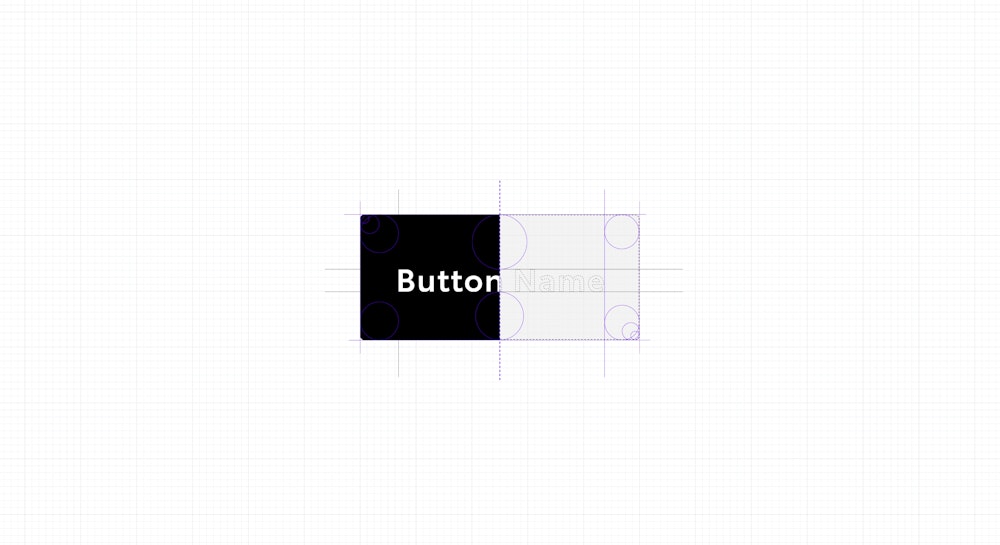
Design System
Components
Service Design
Team Development
Team Lead
UI Design
What was the problem?
The world’s #2 automaker had just released a tweaked logo, logotype, and general guidelines for how the brand should be used in print media, but no guidelines were developed for digital. The current platform lacked a cohesive Design System and the overall experience was starting to feel dated, consistently scoring low marks in JD Power reviews.
What did I do?
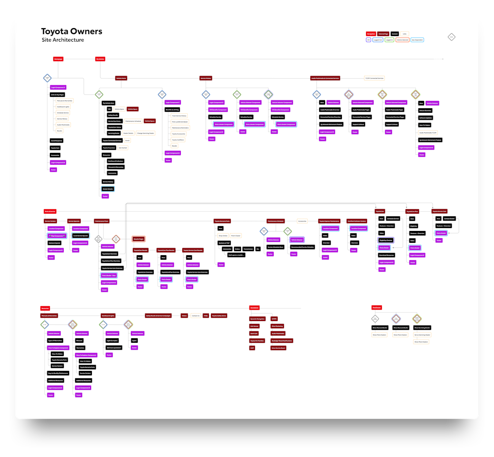
I worked with the team to flesh out the Design System (which you can view here) and began to establish how that system translated into actual page layouts. Today, I lead the Toyota Owners team in that exploration, encouraging designers and producers to reimagine what is possible with the client and embolden elevated design experiences and ideas. Currently we are working on an audit of the platform, which you can view below.
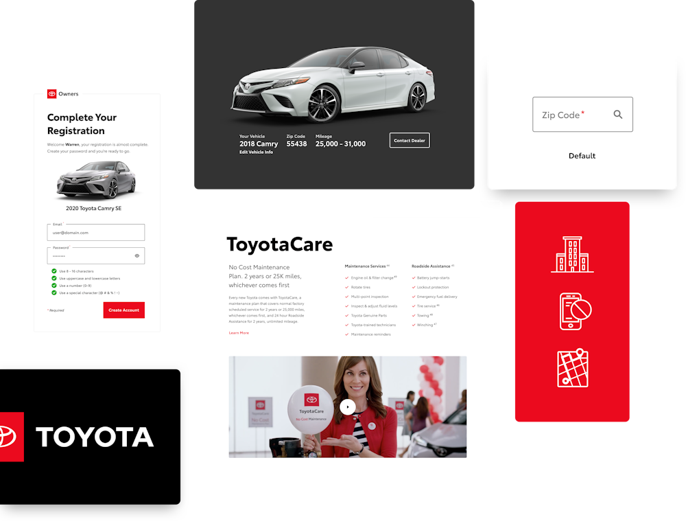
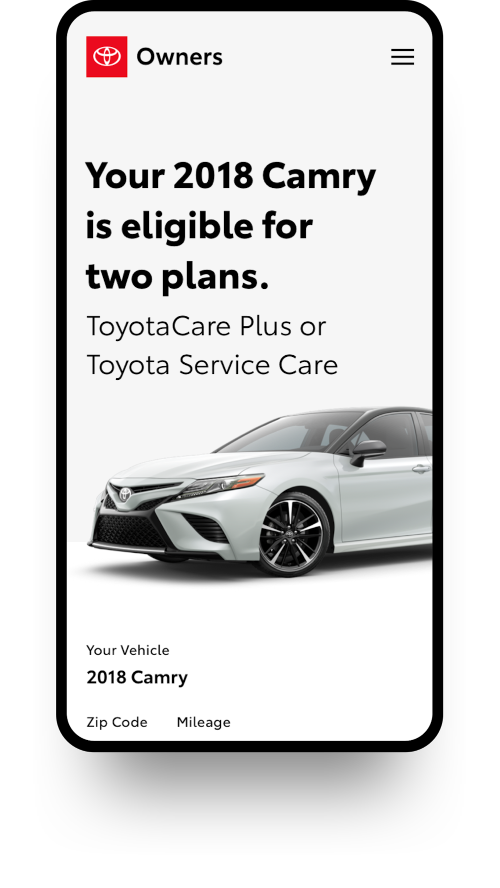
Maintenance Hub
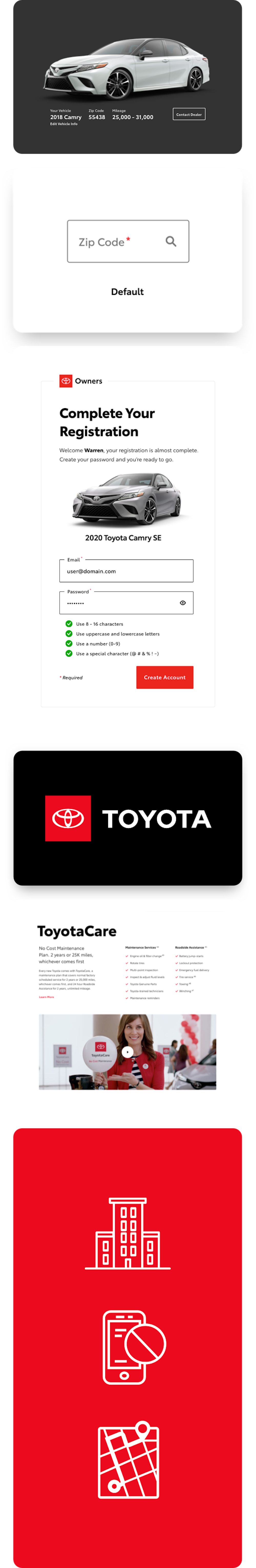
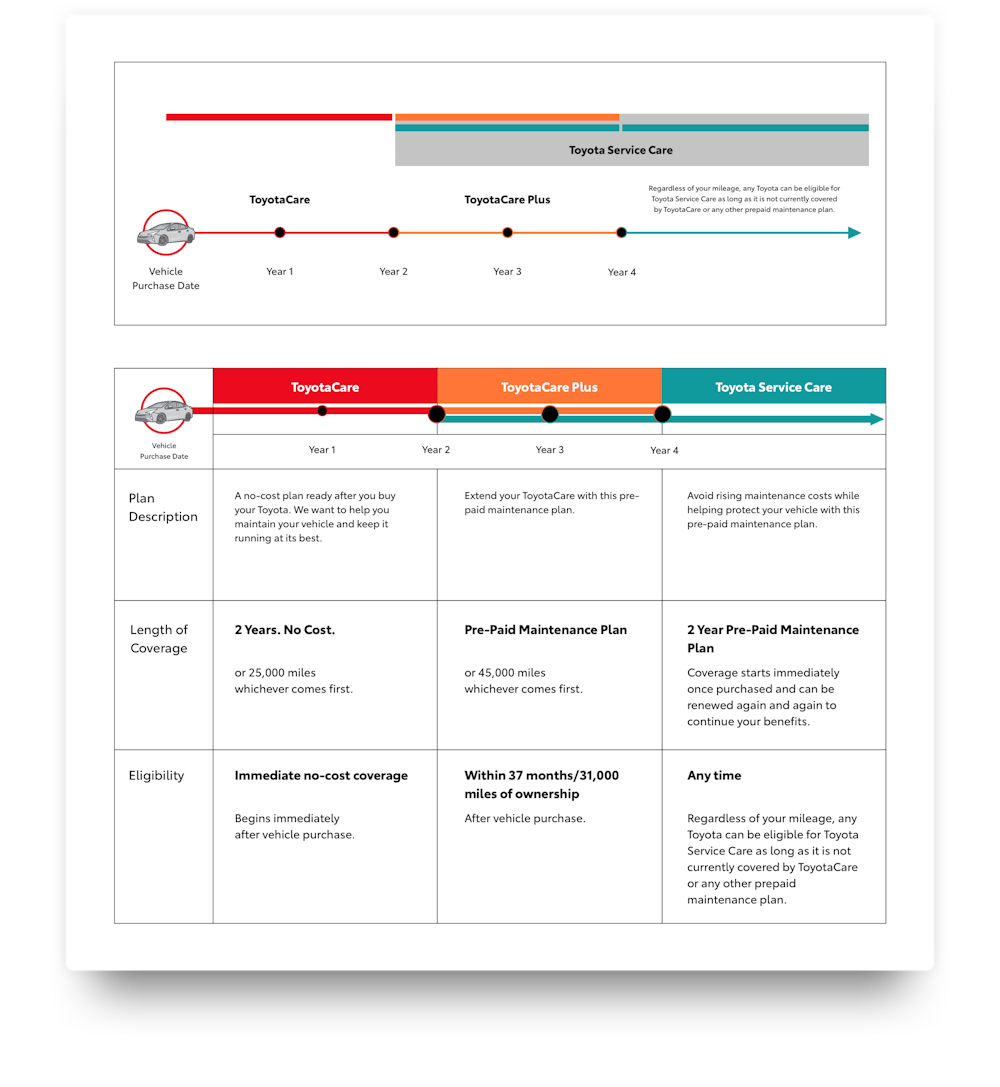
Toyota’s multiple warranty products were confusing for consumers. My role was to guide the team to overcome the issue. I proposed a personalized hub so we could inform customers what warranty product worked best for them, but the team was concerned about pushback due to previous client feedback. I set out to find out why, interviewing everyone who knew the client to get a sense of the situation and found out there were a few buzzwords we needed to avoid. I scheduled some dry run presentations to work with the team to practice those buzzwords out of our vocabulary. When it came time to present, we were ready, and it showed.
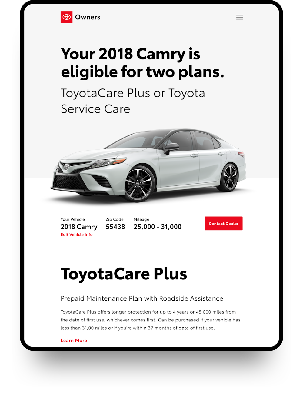
Shared Componentry
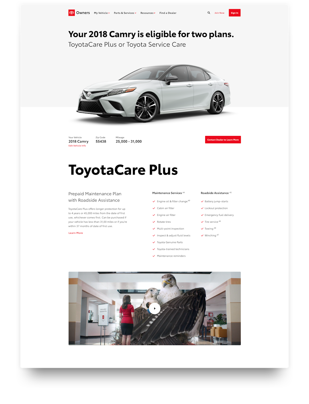
During the maintenance hub project, the team had another project that was running simultaneously, both requiring that a customer choose their vehicle so the system could recommend a service. Identifying this early on, I rallied the UX designer on each project to ensure to ensure design cohesion through shared componentry, which at the time, we didn’t have. Concurrently I began identifying all use cases for the Vehicle Selector and built out this document to track the complex use cases.
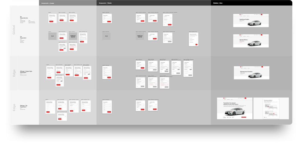
Audit
Toyota Owners serves as the post-purchase support mechanism for Toyota, so the site supports every vehicle Toyota has ever made, as far back as the 1979 Supra. Though an incredible resource of information, the site was in need of a refresh, and one that put the user in the drivers seat of a personalized experience. In order to make informed decisions we needed strategy, which we didn’t have. I made the pitch to reintegrate strategy into the platform and this audit below was the first step in that process. More to come…
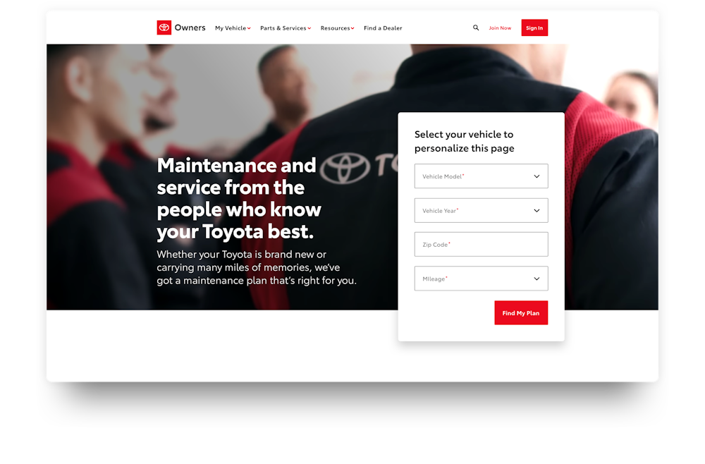
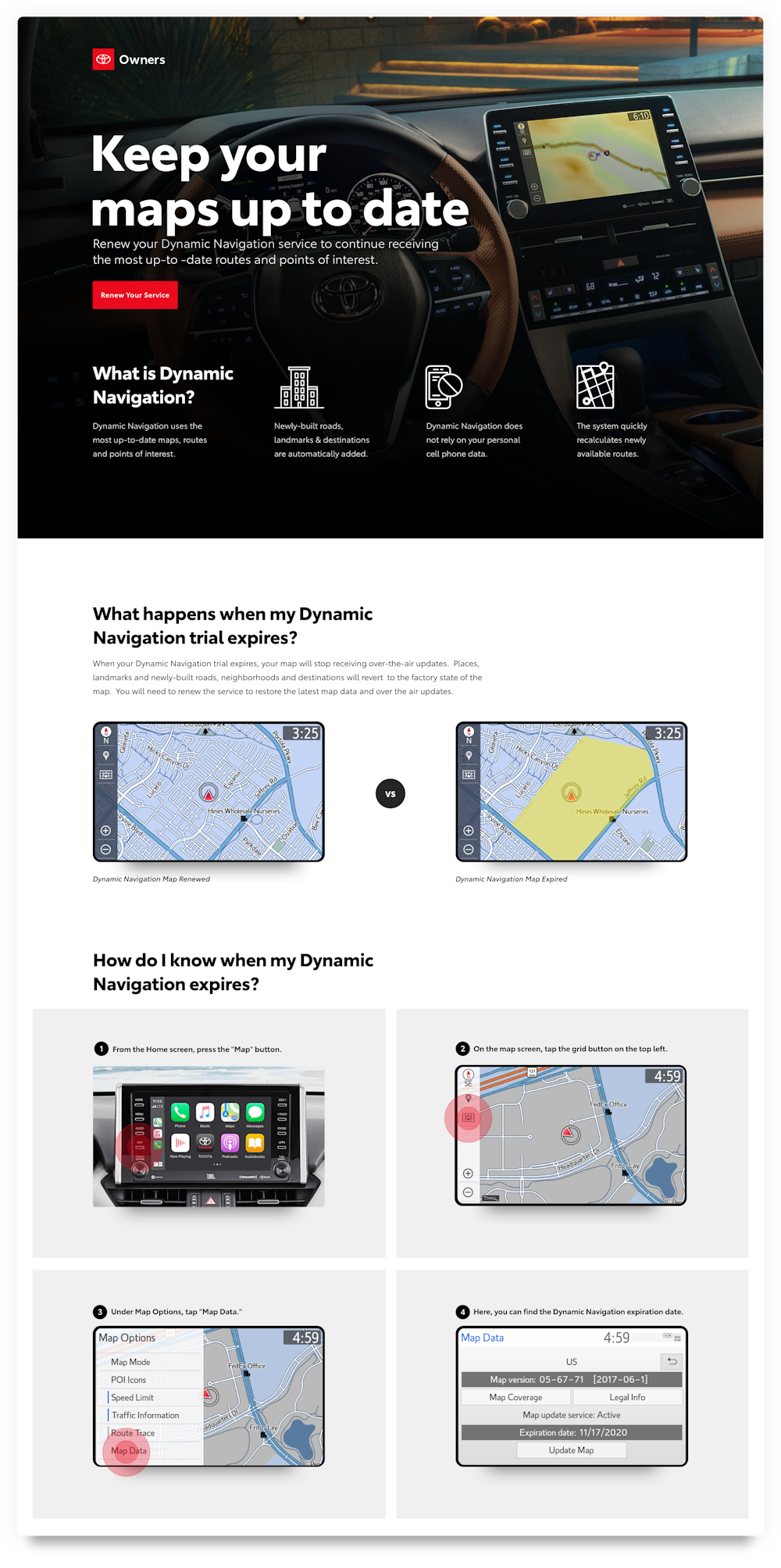
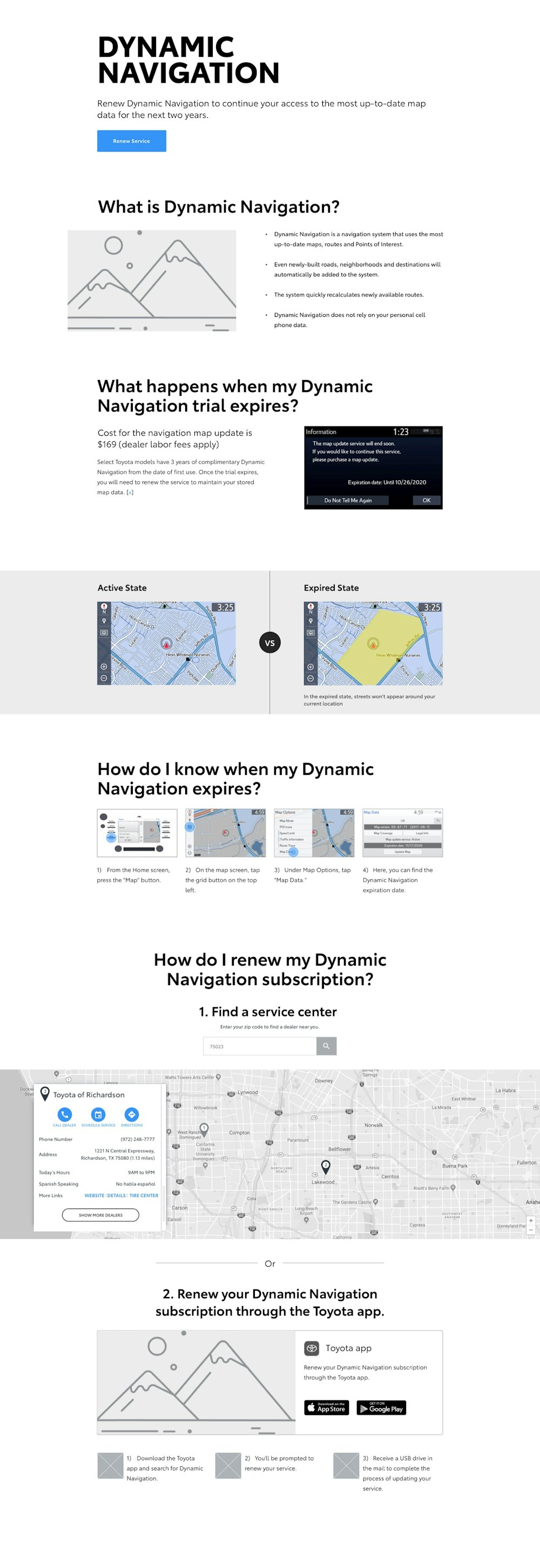
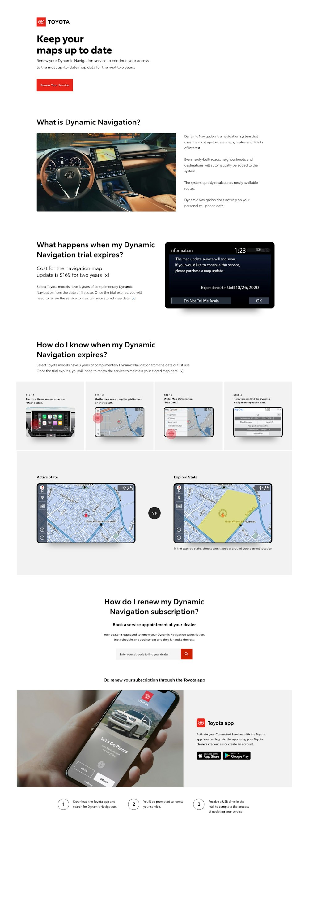
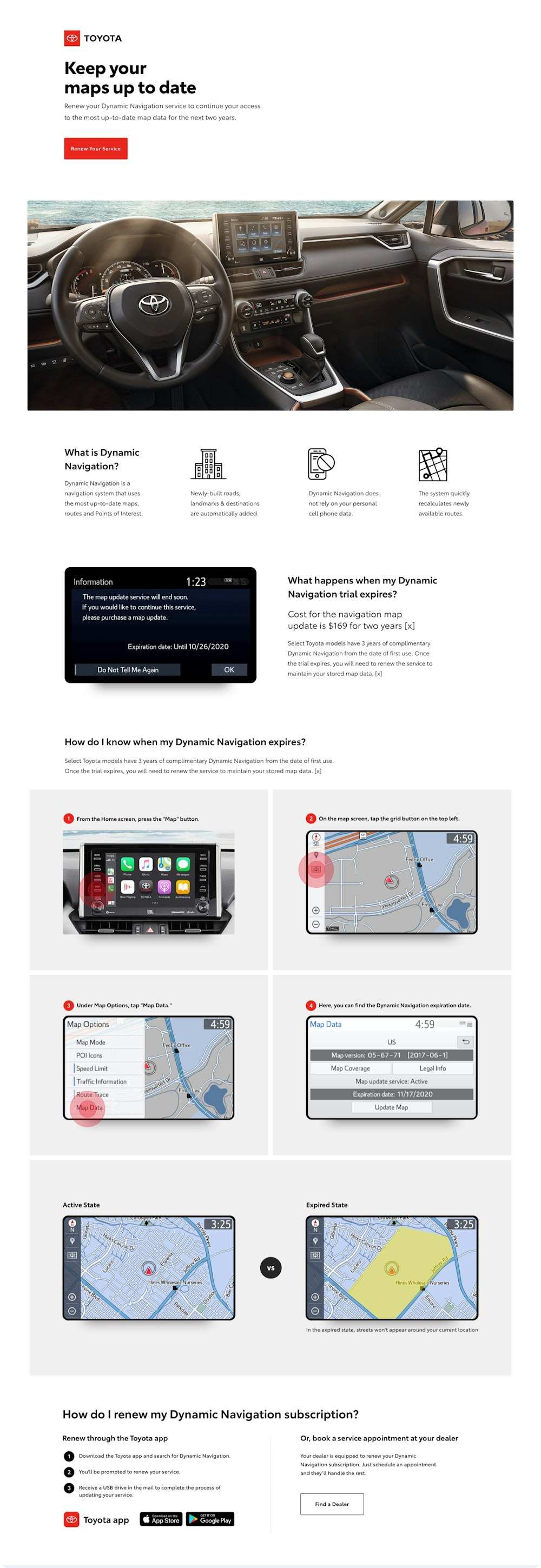
Dynamic Navigation
This simple standalone would act as a landing page for customers who needed to renew their navigation subscriptions and educate the user on the product. Below you will find the wireframe, the ‘safe’ design, and a middle ground layout — but first you will see a design that many internal partners said would never pass because it was too bold for Toyota’s more conservative aesthetic. We were all delighted when the latter design was chosen, a sign that Toyota could move towards elevated design.
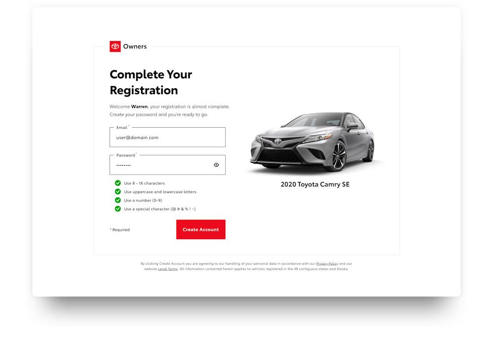
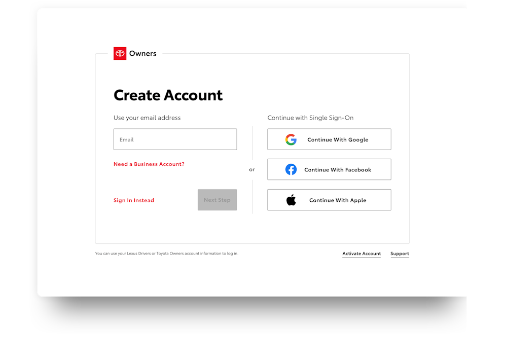
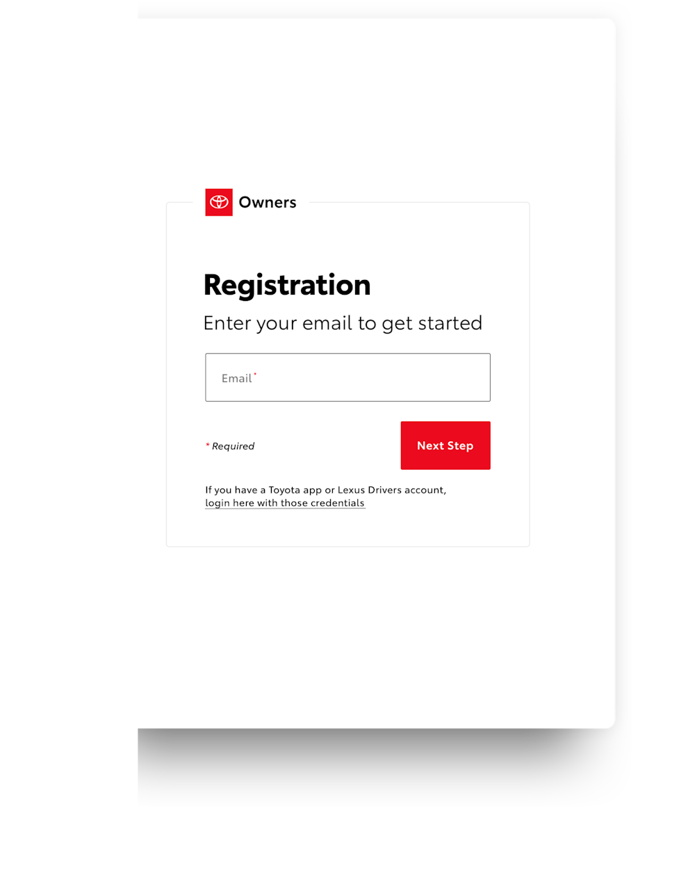
Registration Flow
As you’ll learn from my Case Study of the Toyota VIS Design System, one of my main contributions to the system was Buttons and Forms. We decided to use the Toyota Owners platform as the testing ground for these elements to validate our design decisions, specifically, the registration process.