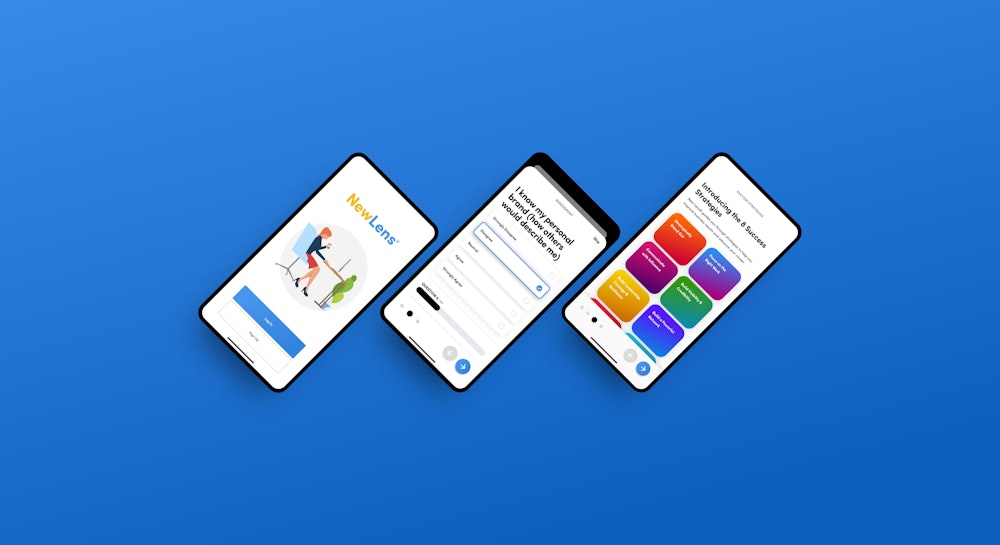


Toyota VIS System
Role
Design System
Animation
Documentation
What was the problem?
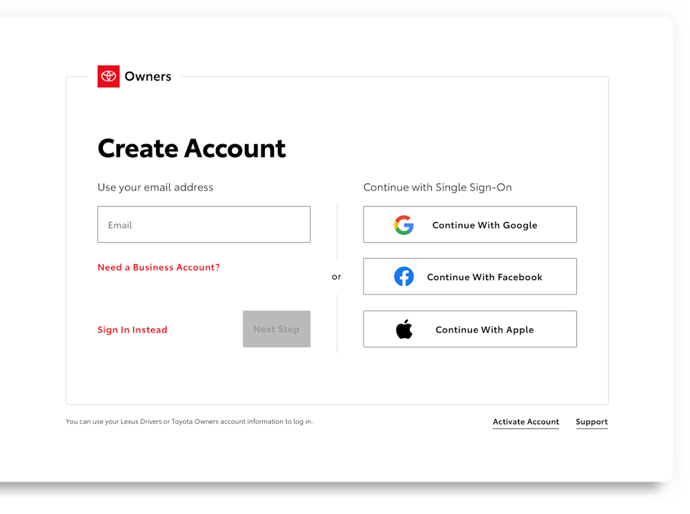
Toyota went through a rebrand in mid-2019 that saw the automaker reveal a flattened logo and bespoke typography for both digital and physical formats. Saatchi & Saatchi LA was tasked with fleshing out the Visual Identity System for all digital platforms including buttons, forms, controls, and more.
What did I do?
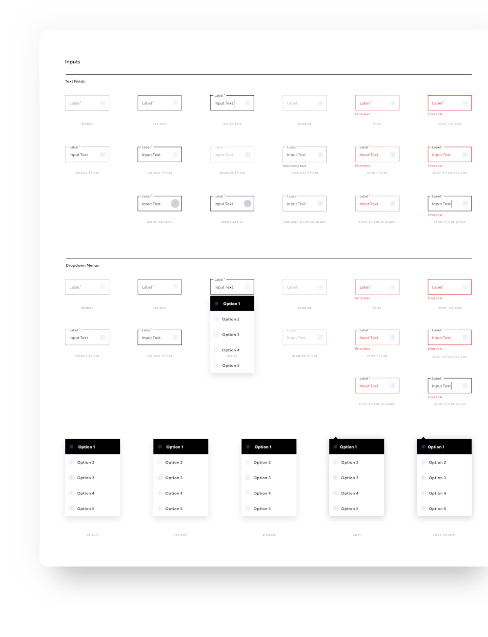
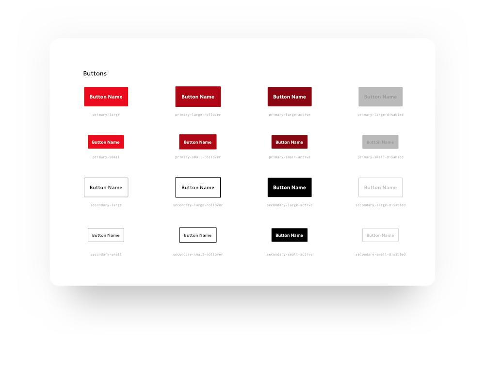
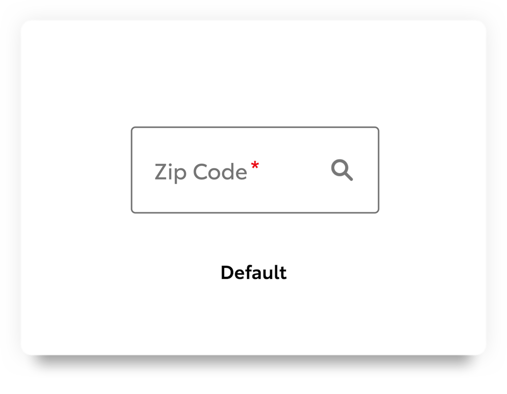
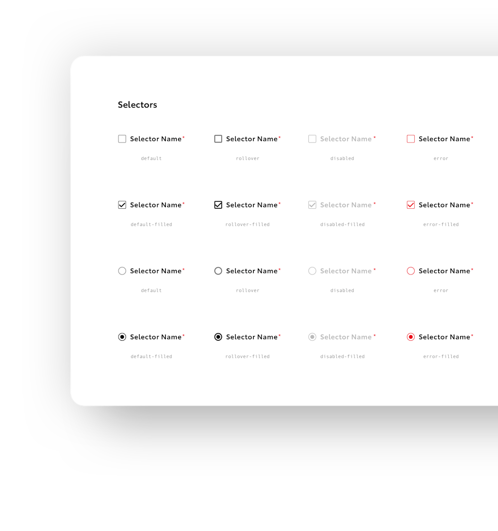
I served as one of three Sr. Designers to build out the system. My role was to develop all components under the umbrella of forms (including search, text fields, dropdowns, filters, selectors, toggles, and more), build those components to be customizable and optimized to empower our design team, develop and document guidelines for implementation, and serve as the point person to our dev team. To create cohesion within the system and support cross-platform implementation for other teams, I developed global interaction philosophies where every component was based on repeatable core theories and patterns.
Outcome
100%
compliance with ADA Standards in both WCAG AA & AAA
25%
increase in product development efficiency
Empowered
designers, producers, and developers to implement the system by providing assets and clear documentation
Achieved
organizational buy-in for development team to incorporate CSS Style Sheet for implementation
16%
decrease in time spent in UAT
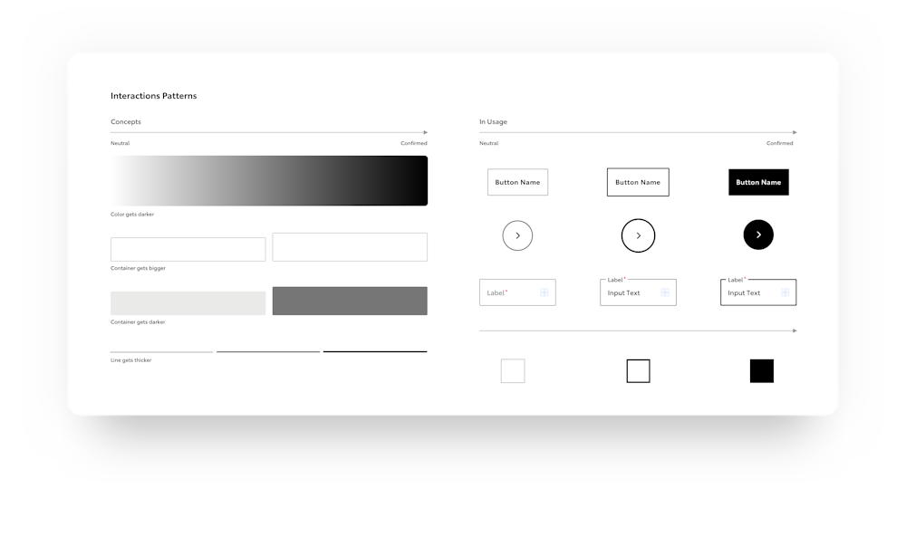
Developing Philosophy
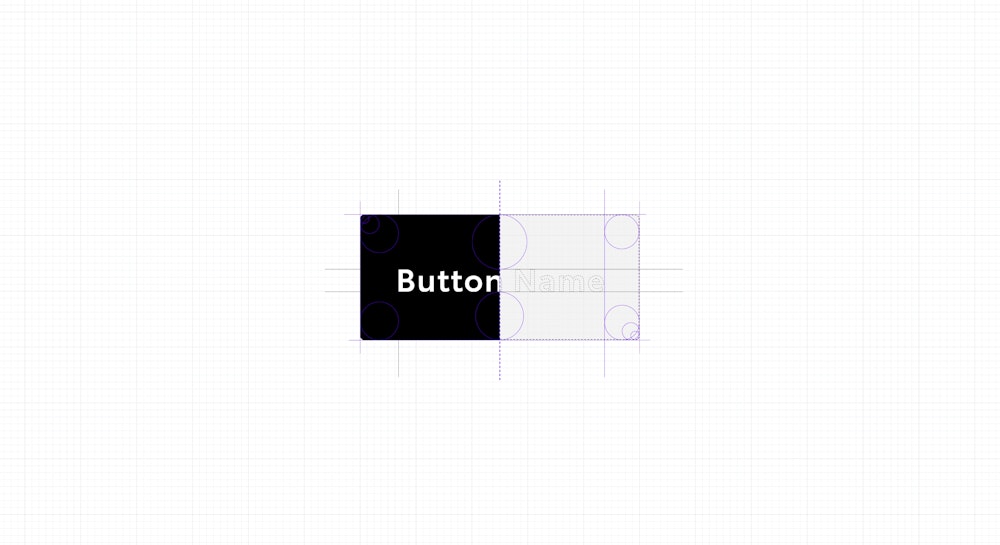
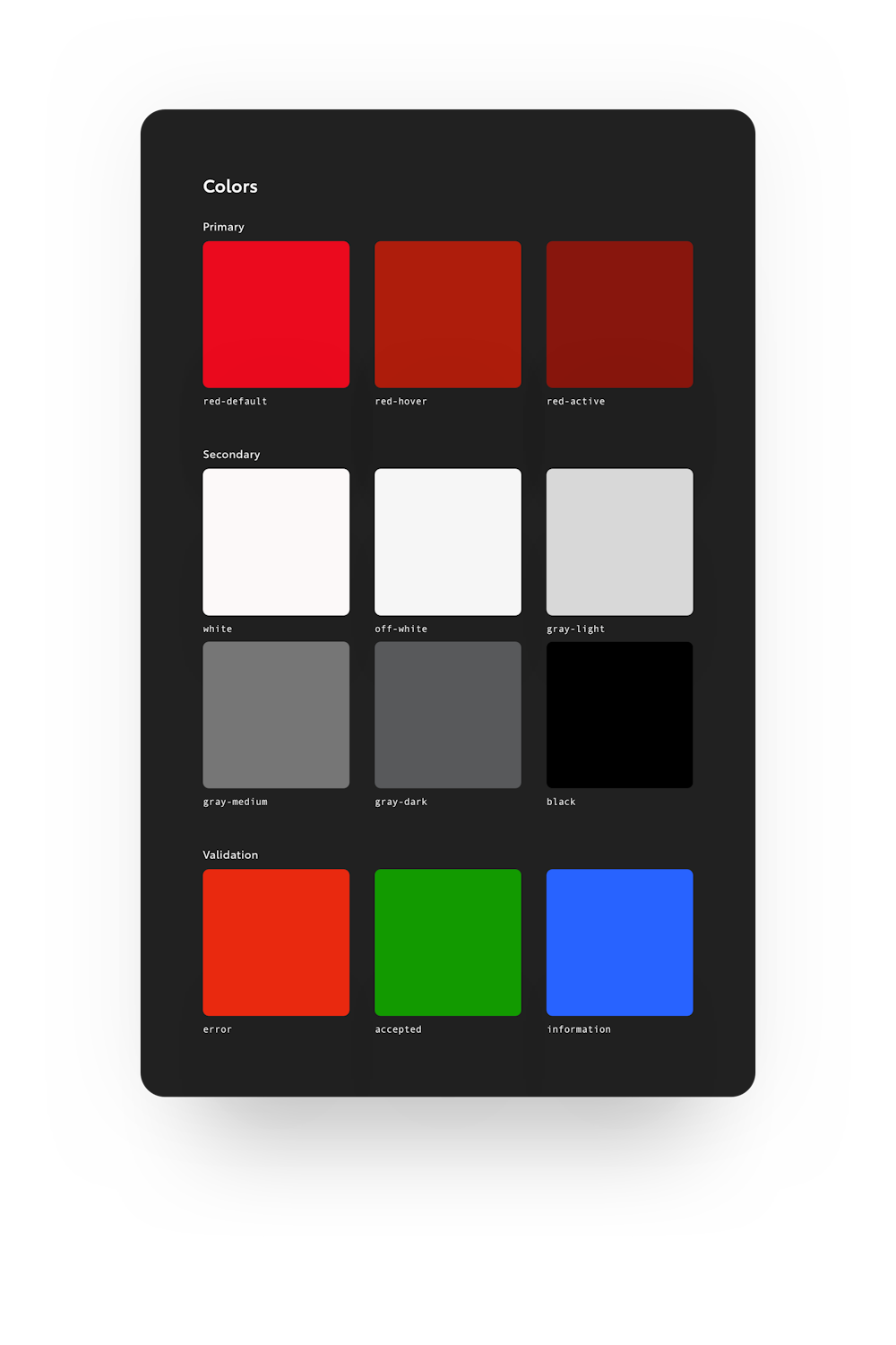
At the core of every great system is purpose. You need a compass to return to when it's time to make the difficult decisions. For Toyota, this compass was rooted in Structured Humanism, Accessibility and Intuitiveness, Tension in Contrast, and Stripped Minimalism. Our core theory was rooted in an 8px system that carried over to everything we did: type, size, space, border, grid, and radius.
Usage Guidelines
After developing the core elements for VIS, we set out to define some usage guidelines to ensure all partners were on the same page about how to use the system. Being very intentional to call these guidelines and not rules, we encouraged designers to challenge the guidelines and recommend their own. Ultimately, the team was empowered to treat the system like a living breathing document.
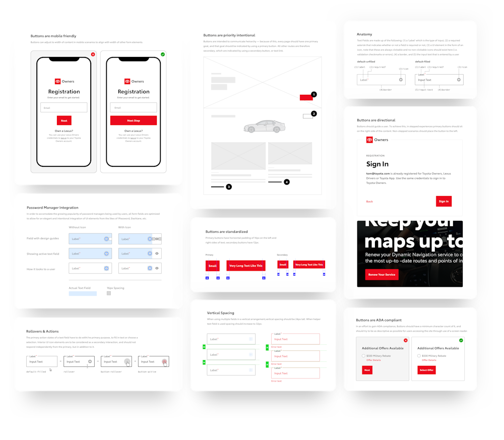
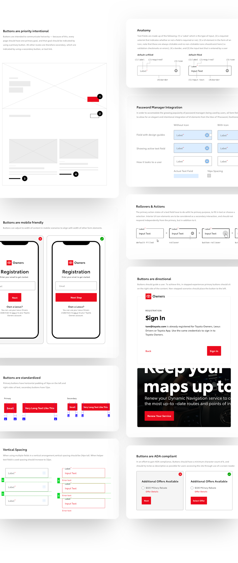
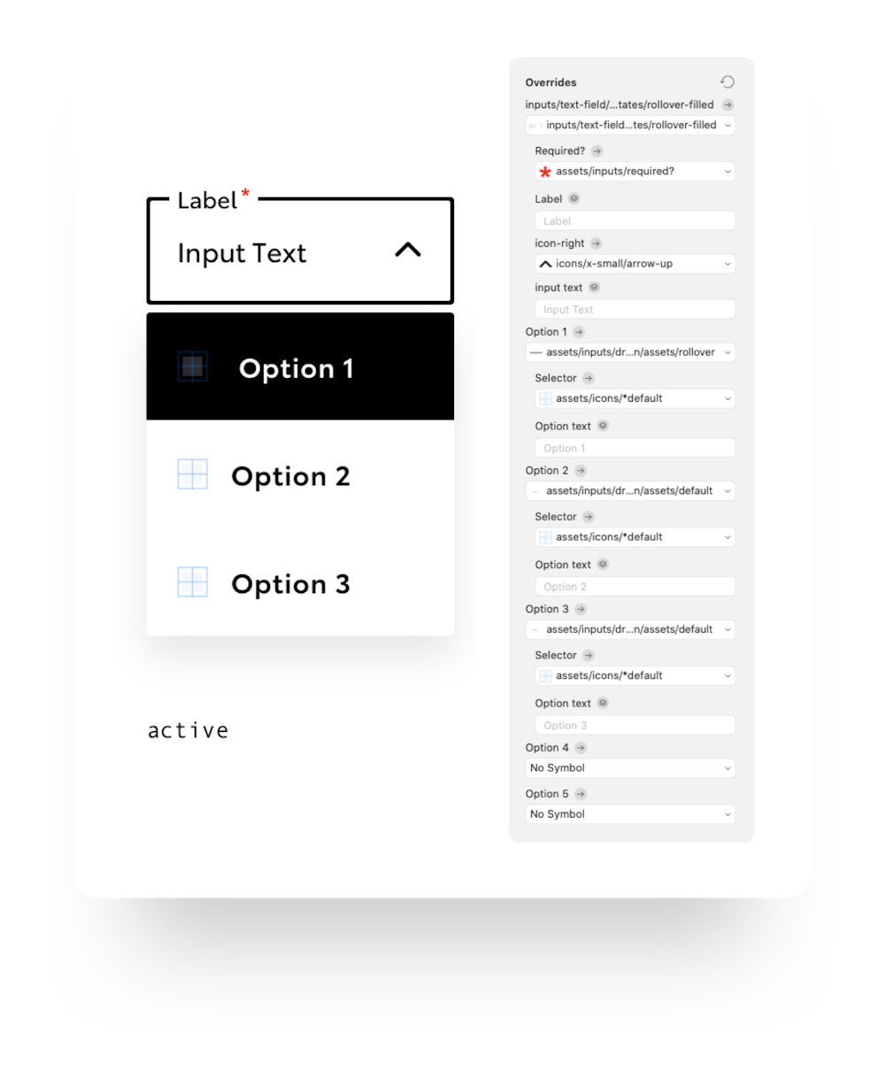
Customization
A well-built design system is dependent on its ability to withstand one action — detaching. I know I know, we should be breaking systems and I 100% agree and encourage designers to go on rampant explorations and flex the system to go where no designer has gone before, but hopefully, most of the time, the system has everything a designer needs. To do that for Toyota, I made sure that all of our components were fully customizable, using nested symbols and overrides galore.
Animations
I helped Saatchi start to envision what animations would look like in the system. There was a subtle grace and quiet sophistication for them that was tough to nail but after many attempts we settled on a style that reflected the brand.